Animating Material-UI Icons with CSS
May 23, 2020
I was building a feature that allows users to edit or delete an item in a list. Nothing fancy really, and that’s why I decided to try out some icon animations to make things more interesting. I know, I know, there are probably a dozen or so “animated icon” libraries available from the Open Source Community, why not just grab one of those? I have one word for that:
“Boooor-ing!”

I wanted to make my own and learn something in the process, so here we go!
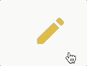
Animating the Edit Icon

I wanted to keep things as performant as possible and avoid any layout shifts or repaints so I went with the transform property and used rotate and translate (for positioning) with my @keyframes. For more on performance with animations I recommend checking out this article on HTML5Rocks.com
I put together a quick hover style that targets the <path /> element inside the <Edit /> icon. All I needed was rotate and translate function values to make the pencil appear to flip, erase the mistake, then flip back and write something as it moves to the right.
import React from "react";
import { keyframes } from "@emotion/core";
import { SvgIconProps } from "@material-ui/core";
import { Edit as MuiEdit } from "@material-ui/icons";
import { IconWrapper } from "~/components/AnimatedIcons";

const pencilEdit = keyframes`
    0% {
        transform: rotate(0deg)
    }
    20% {
        transform: rotate(170deg)
    }
    25% {
        transform: rotate(140deg) translate(1px, 0);
    }
    30% {
        transform: rotate(170deg) translate(2px, 0);
    }


    45% {
        transform: rotate(0deg) translate(0, 0);
    }
    55% {
        transform: rotate(0deg) translate(0, 0);
    }


    60% {
        transform: rotate(-30deg) translate(1px, 0);
    }
    70% {
        transform: rotate(0deg) translate(2px, 0)
    }
    80% {
        transform: rotate(-30deg) translate(3px, 0)
    }
    90% {
        transform: rotate(0deg) translate(3px, 0)
    }
    100% {
        transform: rotate(-30deg)  translate(4px, 0)
    }
    `;

const Edit: React.FC<SvgIconProps> = props => {
  return (
    <IconWrapper
      css={{
        "&:hover": {
          "path:first-of-type": {
            transformOrigin: "center",
            animation: `${pencilEdit}  1.5s forwards 1`,
          },
        },
      }}
    >
      <MuiEditIcon {...props} />
    </IconWrapper>
  );
};
For readability, I added extra line breaks in between each animation section.
0% - 30% for erasing.
45% - 55% for the brief pause.
60% - 100% for the writing.
And the final result!
Animating the Delete Icon

Animating the <Delete /> icon had some added challenges. I couldn’t use a :hover pseudo-class because I needed two separate @keyframes animations; one for the lid to fly off that was triggered by onMouseOver and one for the lid to land back on the trash can that was triggered by onMouseOut. No problem! Here’s the SVG path that’s nested in the <Delete /> icon:
<path
  d="M6 19c0 1.1.9 2 2 2h8c1.1 0 2-.9 2-2V7H6v12zM19 4h-3.5l-1-1h-5l-1 1H5v2h14V4z"
></path>
OK one problem, there’s only one path, so targeting just the lid wasn’t going to be that easy.
I read up on SVG paths and was able to separate the two shapes into separate path elements. I think in this case I was lucky, because there are only two M commands which are used to move the cursor to a new location without drawing a line, and since there were only two shapes I just split the string at the second M command and created two <path /> elements. With these two paths I no longer needed the material-ui Delete icon, so I wrapped my two paths in the material-ui SvgIcon component:
<SvgIcon {...props}>
  <path d="M19 4h-3.5l-1-1h-5l-1 1H5v2h14V4z" />
  <path d="M6 19c0 1.1.9 2 2 2h8c1.1 0 2-.9 2-2V7H6v12zM19 " />
</SvgIcon>
Now with two separate paths I created two @keyframes (openTrash & closeTrash), and toggled them with the mouse over/out events:
// the lid flies up
const openTrash = keyframes`
    0% {
        transform: translate(0, 0)
    }

    100% {
        transform: translate(0, -10px);
    }
`;

// the lid falls and lands on the trash can
const closeTrash = keyframes`
    0% {
        transform: rotate(10deg) translate(-2px, -10px);
    }
    50% {
        transform: rotate(10deg) translate(-2px, -2px);
    }
    70% {
        transform: rotate(-10deg) translate(2px, -2px);
    }
    90% {
        transform: rotate(10deg) translate(-2px, -2px);
    }
    100% {
        transform: rotate(0deg) translate(0, 0);
    }
`;

const Delete: React.FC<SvgIconProps> = props => {
  const [animationStyle, setAnimationStyle] = useState({});

  function handleMouseOver() {
    const style = `${openTrash} 0.5s forwards 1`;
    setAnimationStyle(style);
  }

  function handleMouseOut() {
    const style = `${closeTrash} 0.25s forwards 1`;
    setAnimationStyle(style);
  }

  return (
    <IconWrapper
      onMouseOver={handleMouseOver}
      onMouseOut={handleMouseOut}
      css={{
        "path:first-of-type": {
          transformOrigin: "center",
          animation: `${animationStyle}`,
        },
      }}
    >
      <SvgIcon
        focusable="false"
        viewBox="0 0 24 24"
        aria-hidden="true"
        {...props}
      >
        <path d="M19 4h-3.5l-1-1h-5l-1 1H5v2h14V4z"></path>
        <path d="M6 19c0 1.1.9 2 2 2h8c1.1 0 2-.9 2-2V7H6v12zM19 "></path>
      </SvgIcon>
    </IconWrapper>
  );
};
And the final result!
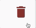
Happy Coding!